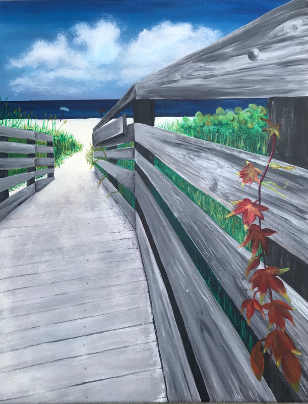
final project
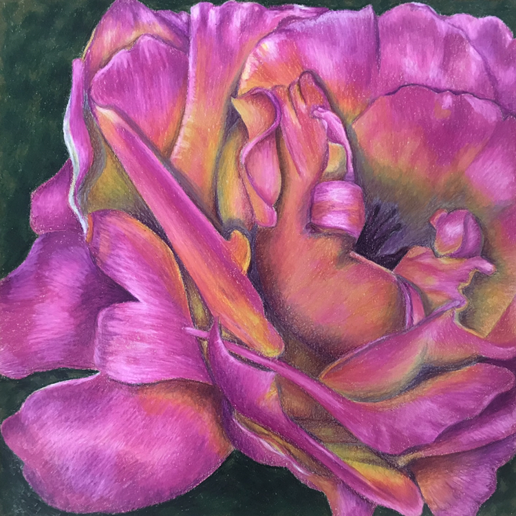
Shown above is the final product of my third concentration project. This piece was done in prismacolor pencils, and is based off a photo which I took of a flower in my front yard. In order to make this piece fit in with the rest of my concentration pieces, I had to edit the original photo in order to add unique colors. This editing helped to make the flower stand out as one of mother nature's beautiful simplicity's.
The first step to creating this piece was sketching out the individual flower petals. This process was very time consuming because it was very challenging to make sure that every petal was lying in the right direction and had the right amount of depth and spacing. Once I had the flower sketched, I began coloring each petal one at a time. I began this process with yellows towards the center, and gradually adding darker pinks towards the edges of each petal. Then, I had to go in with a super light purple and white to add glare to the edges or the curves of the petals.
I realized very early on in this project that shading and highlights were the key to successfully depicting this image of a flower. Adding super dark purples and whites helped to give the flower depth and volume, making it look more realistic. This project was very time consuming and challenging, but it taught me a lot about drawing flowers. Overall, I am happy with how this project turned out. It certainly taught me a lot about the complexities of nature and how much effort it takes to recreate them through artwork.