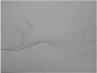
In this one point perspective drawing, I drew some buildings and a fence going towards a vanishing point. It was interesting to see how realistic a drawing can look when you draw it with the right perspective.
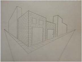
Two point perspective was very fun to learn. I enjoyed drawing buildings a sidewalks from the corner of a street so that you can see both sides of the sidewalk.
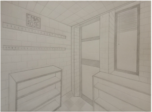
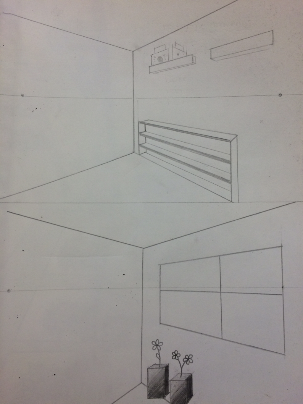
Drawing the corner of the art room was challenging yet interesting. I got to learn how to draw the inside of a room with a door, a window, shelves, and hooks.
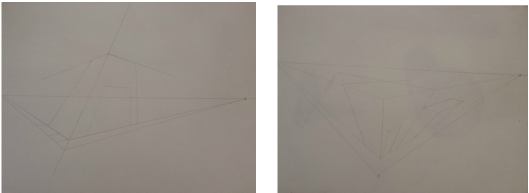
3 point perspective drawing is very tricky yet interesting. It was cool to learn how to draw buildings as if you are looking up at it or down on it from an angle.
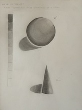
Drawing a value chart and shapes was a very good learning experience for me. It taught me how to make different values just by pressing on my pencil with different amounts of pressure.
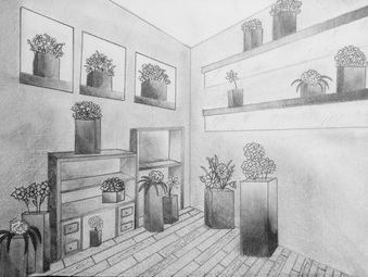
For this assignment, I decided to use rectangular prisms as flower vases. Flower vases are not usually rectangular prisms, so I thought that would be an interesting image. I drew posters, shelves, and windows in the image to add some detail, and I tried to add shading to make it look more realistic. I used two point perspective to make the shapes come to life and look proportional.
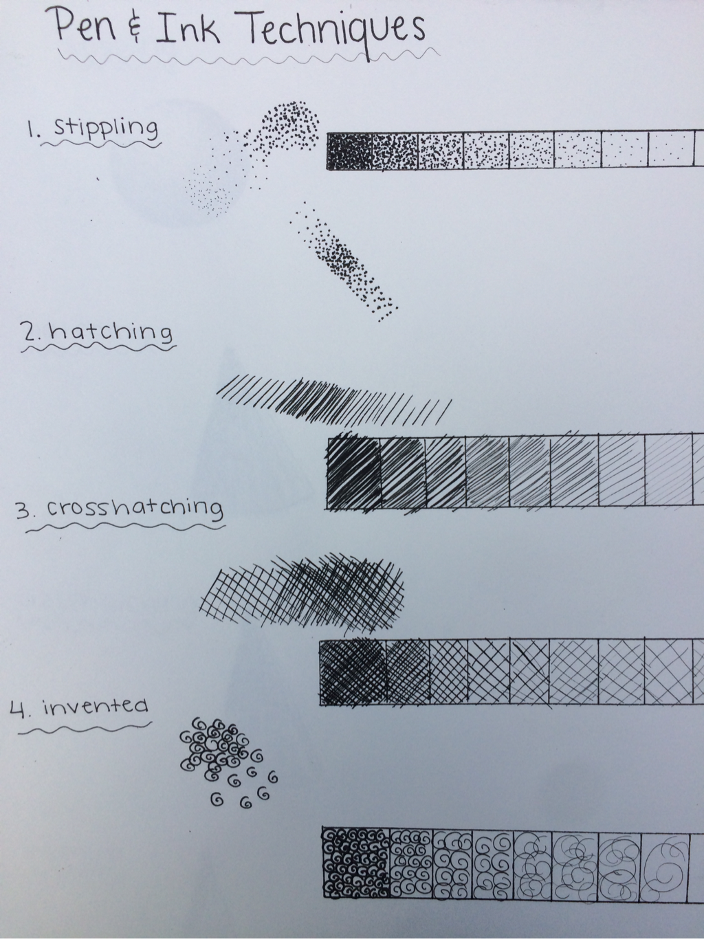
This is my value charts for pen and ink. By doing these charts, I was able to learn how to layer up pen and ink to make different values. When you make stipples, hatches, or invented marks close together the value will look darker than if they are far apart.
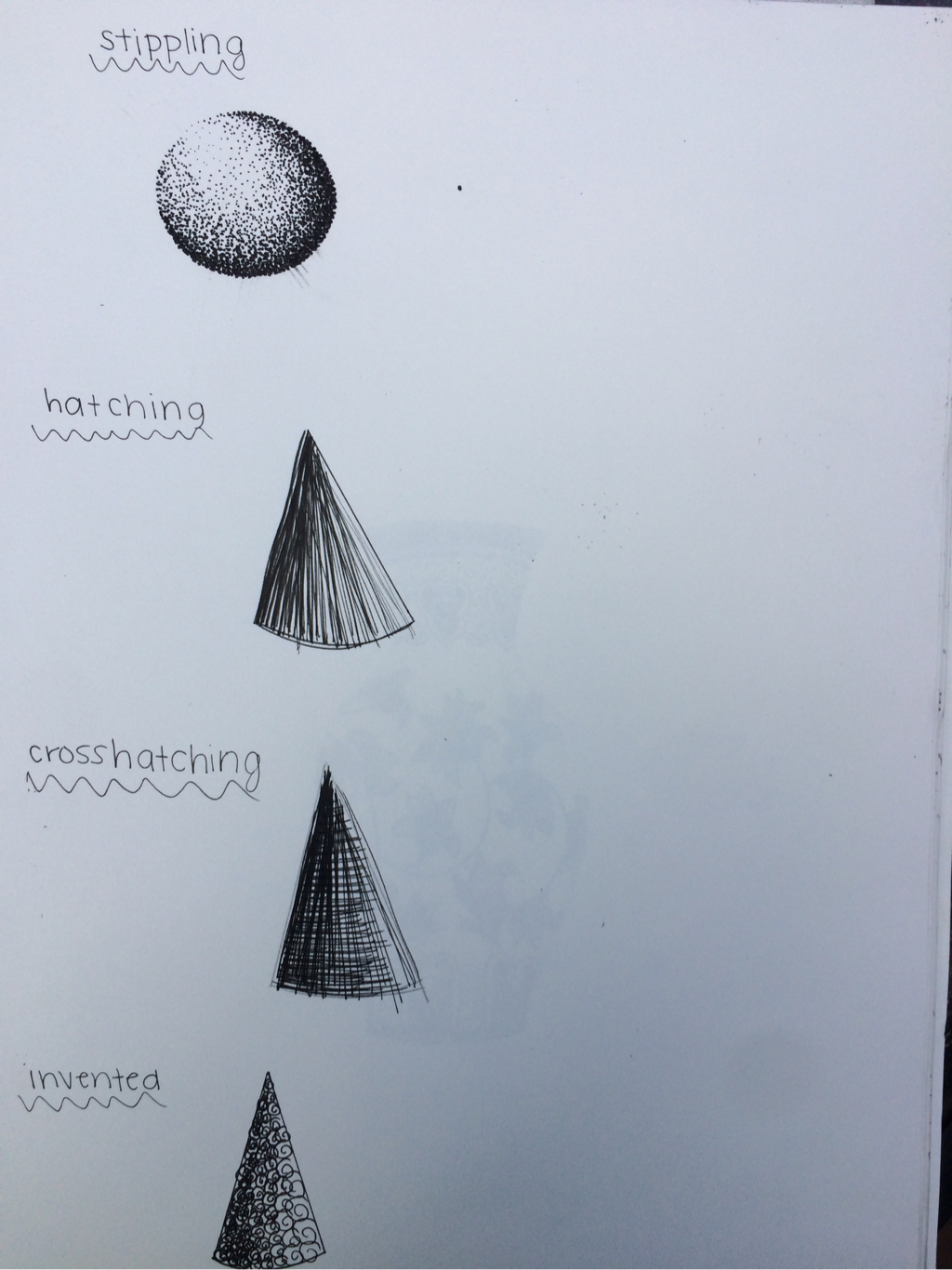
These are my pen and ink shapes. I practiced shading and adding value to the shapes by layering up the pen and making the marks smaller.
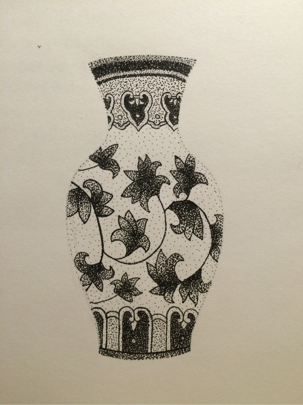
For this vase, I decided to use stippling to add the value and shading. It was a good learning experience and I got to learn how different thicknesses and layers of stipples can make different shades of black.
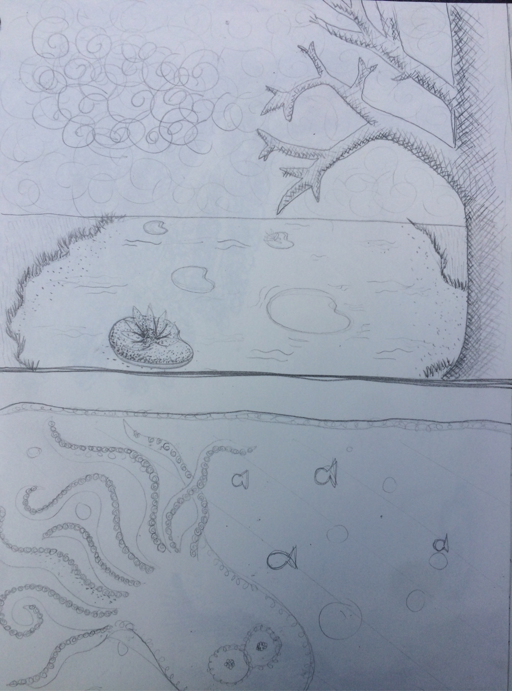
These are my original sketches for my final project. My ideas were to either have a lake with Lilly pads going into the distance or an octopus with fish going into the distance in the background.
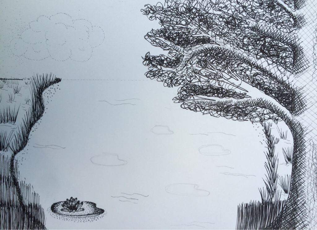
In my final sketch I decided to practice some of my pen and ink techniques. I used inventive for the leaves of the tree and stipple for the Lilly pads. I also practiced hatching on the grass and tree trunk.
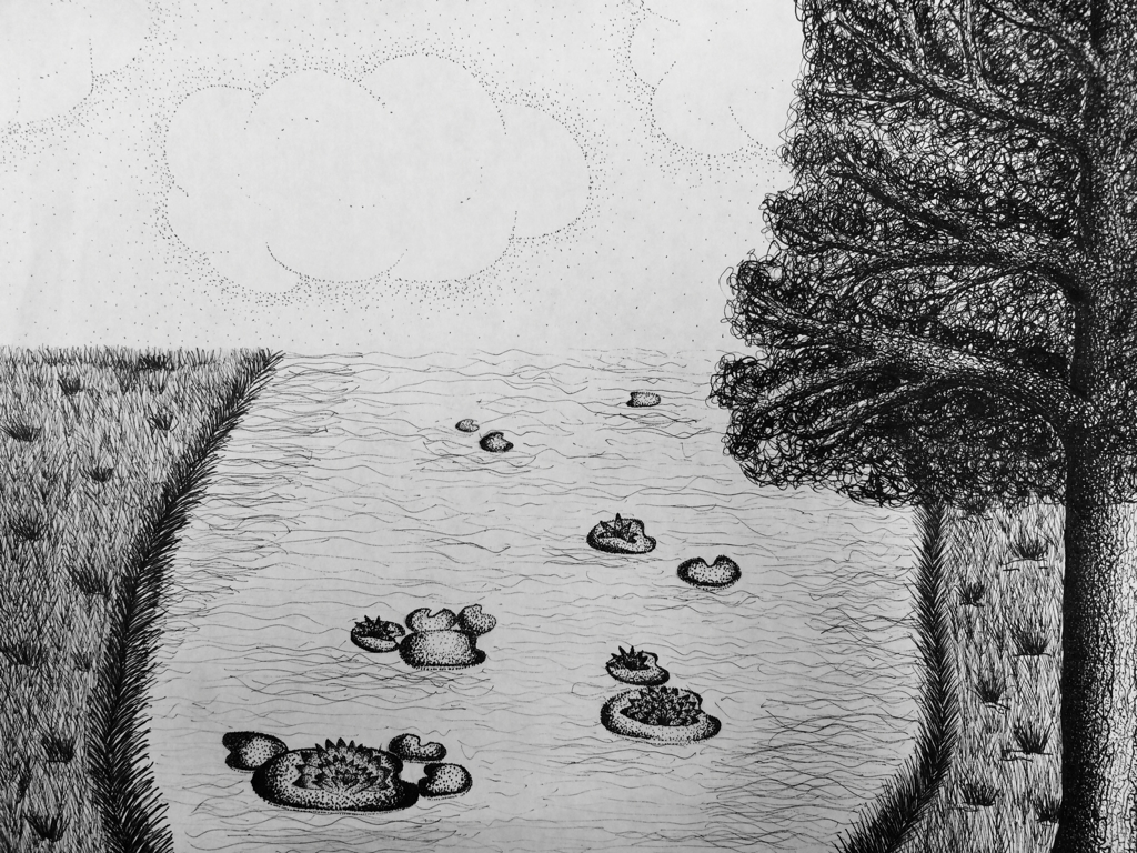
My final project is pictured above. I used a combination of invented and stipple for the tree trunk, invented for the leaves, stipple for the lily pads and sky, and hatching for the grass. This was a very fun and interesting project to learn the pen and ink techniques and use them to make a realistic drawing with perspective.
1.) For my pen and ink project, I decided to use a few different techniques. I felt that using more than one technique would make the project interesting and it would give each object in nature their unique textures. Using different techniques also gave my pen and ink drawing a larger range of values.
2.) In my project I decided to use the lily pads as the main perspective in the drawing. The lily pads go off into perspective towards a vanishing point. The pond also has perspective because it gets slimmer in the distance and the lily pads and grass around the pond get smaller in the distance as the pond goes further back. Perspective is important to make an image look realistic. Without perspective, a drawing may look 2D and unrealistic.
3.) Texture is important in my composition because it makes the scenery look realistic. Without texture, everything in the image would be very bland and fake looking.
4.) Value is important in this project as well to make everything look realistic. The value helps to show the shading of the objects in the nature and it also helps to make some certain parts of the drawing stand out more than other parts.
5.) I thought my craftsmanship was above average for this project. This is because I was able to apply different types of pen and ink techniques. I was also able to add perspective, texture, and value to the project to make it look more realistic. Overall, I believe that I was also pretty neat with my techniques. The stipples don't have tails and the lines are controlled.
6.) If I could recreate my artwork, I would change the value of the grass on the edge of the pond so that it wouldn't stand out as much as it does. I would also add more value in the grass to make it look more realistic.
7.) When applying pen and ink techniques it is important to understand the concepts so that the final product ends up looking neat and realistic. If you are rushed and sloppy while using the pen and ink techniques, the drawing may end up looking messy and unrealistic. You want to make sure that you understand how to control your stipples, hatches, cross hatches, or invented techniques so that the drawing ends up looking amazing.
8.) I think that this project has taught me many interesting and useful techniques for art. I learned the different pen techniques, shading, perspective, and many other things. Because I learned this, I now know how to make drawings look more mature and realistic.
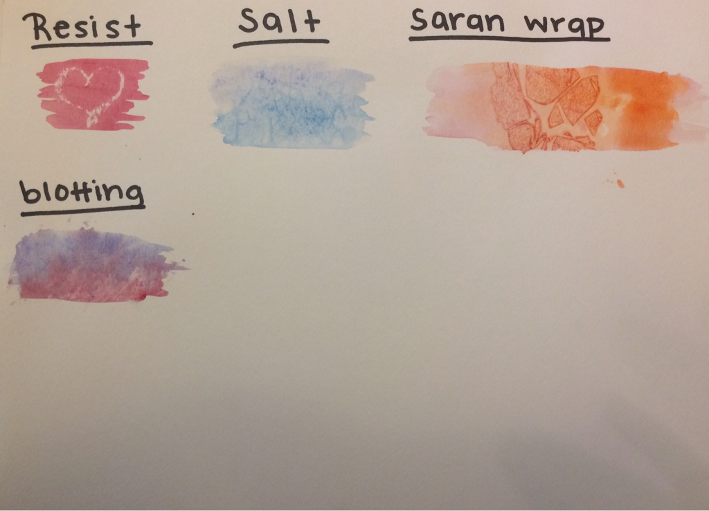
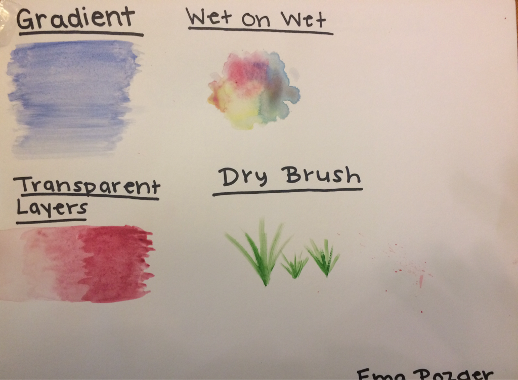
These are my paint techniques that I practiced. It was very interesting to learn all of the different values and textures that you can get using water color paint. I learned how to make transparent paint vs. saturated paint and how to use items such as Saran Wrap and salt to give it the look of texture. It was fun to learn these different techniques, because now I can apply them while I am painting objects such as apples to make them look interesting and realistic.
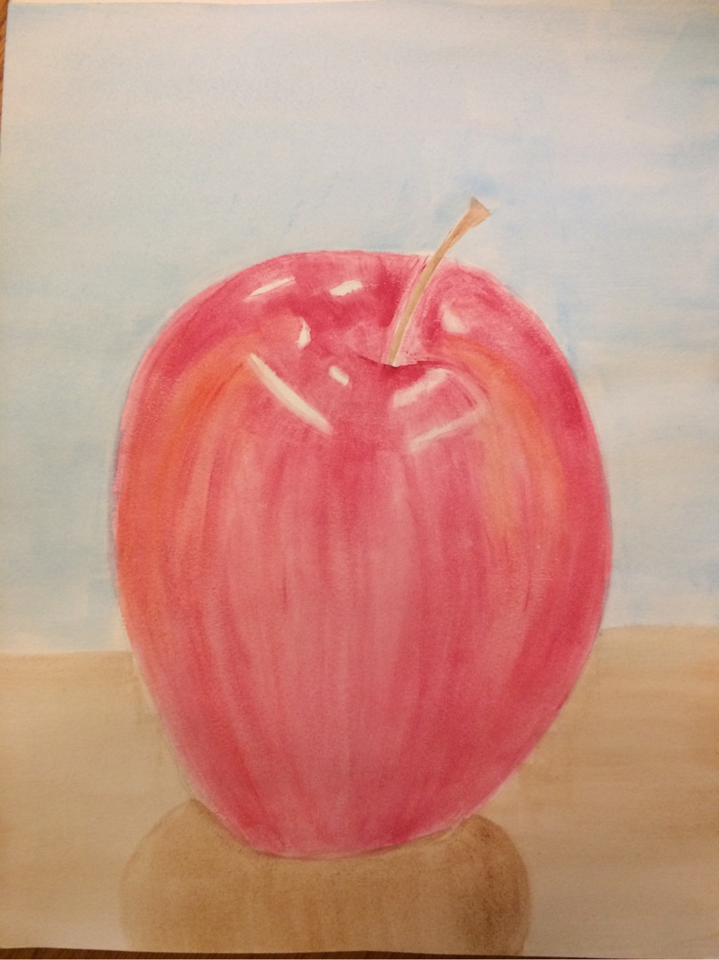
This was my first attempt at painting an apple. While painting this, I tried to make it look realistic by using the painting techniques that I learned. I used a dry brush towards the end to show the streaks that naturally occur in the apple. I started off with a light base color and gradually added deeper tones to add more value and shading to certain parts of the apple.
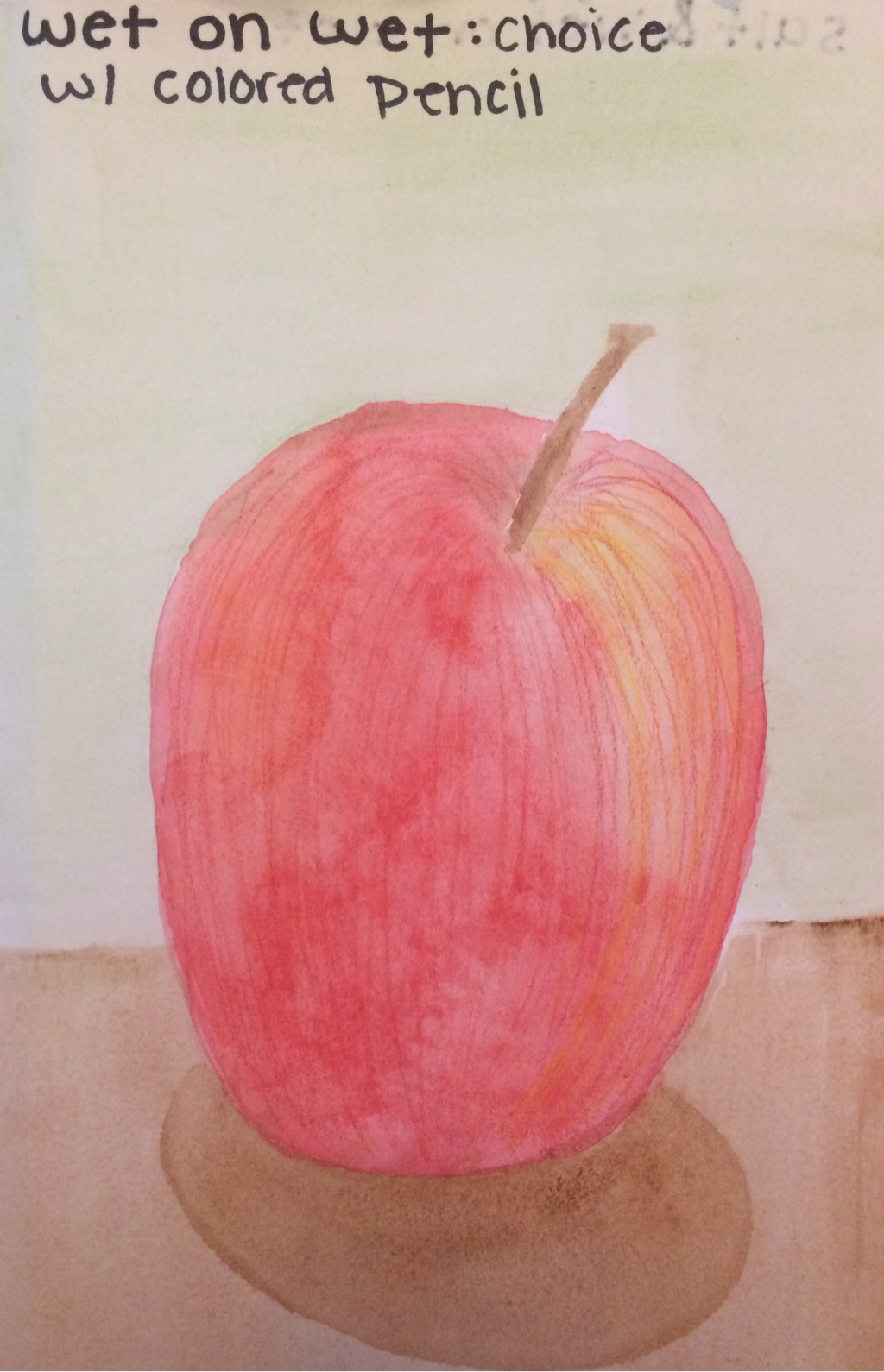
This was my choice apple. I decided to try out the wet on wet technique. I learned that it is difficult to control the values and colors, but the end result looks interesting. I added colored pencil after the paint had dried to show some more value and streaks on the apple.
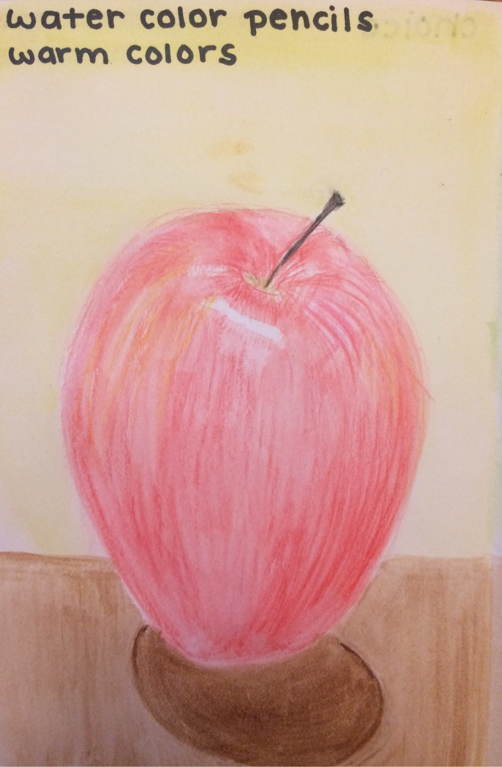
For my second apple, I used the water color pencils to show value. I really enjoyed using these pencils because I thought they were easier to control than paint, and when you layer them up they share very good value.
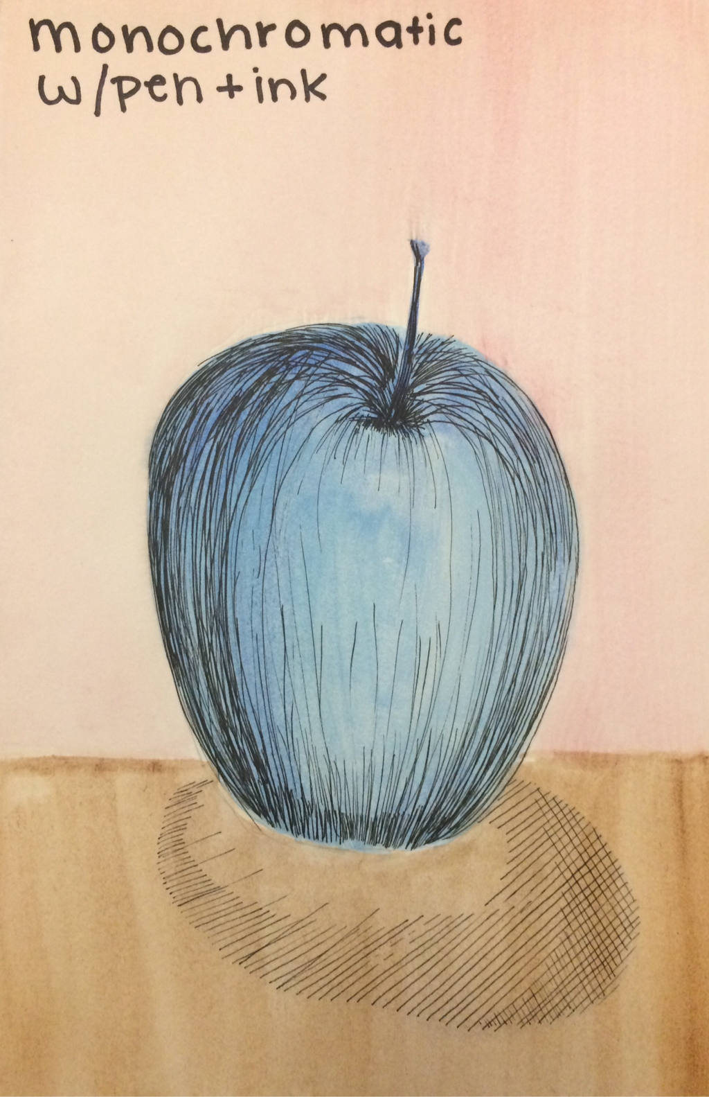
My third apple was monochromatic. I decided to use blue because I thought it would be interesting and it could be cool with the different values. I definitely think that I could have added a little bit more value to the shadows of the Apple, so that if I were to turn it into grayscale I would be able to see value changes. After painting the Apple, I added pen and ink. This helped to bring out the value in the shadows and highlights of the apple. I used controlled hatching as my pen and ink technique.
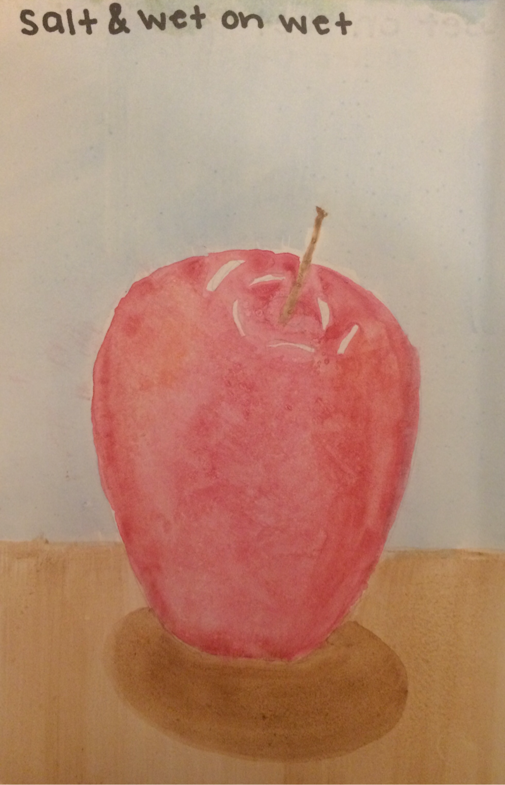
My last apple was wet on wet and salt technique. I wanted to try the wet on wet again to see if I could figure out how to control it a bit more. The salt didn't work as well as I would have hoped, maybe I should have added a bit more paint before applying the salt. But this was a very good learning experience for me and it was cool to paint an apple in a way I would have never thought of painting with water color before.
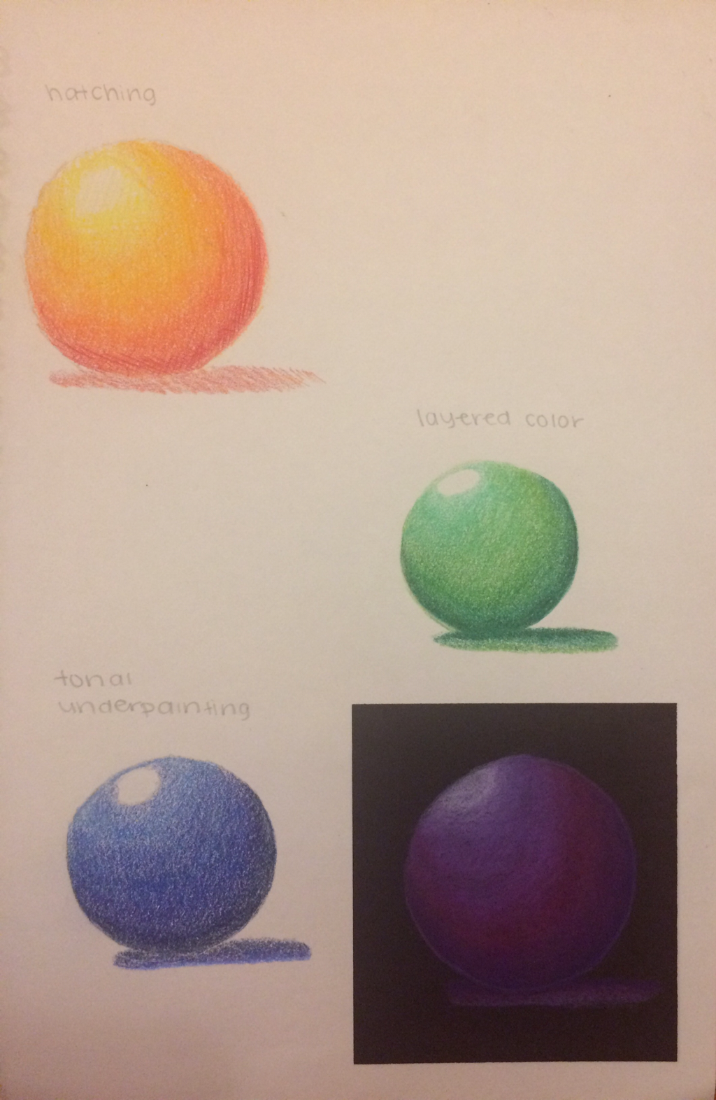
These are my prismacolor spheres that I drew to practice shading techniques with colored pencils. I really enjoyed drawing with the prismacolor pencils because they draw very smoothly and the different colors are able to blend together like butter.
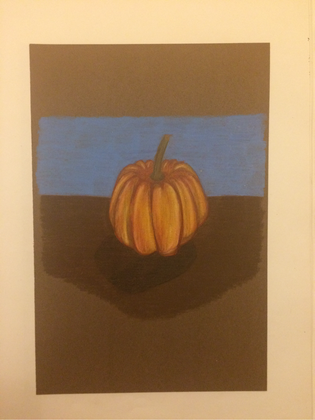
My prismacolor pumpkin is pictured above. I used different yellows, oranges, reds, and purples to add value to the shape of the pumpkin. It was fun to draw a pumpkin because the shape and shading is interesting.
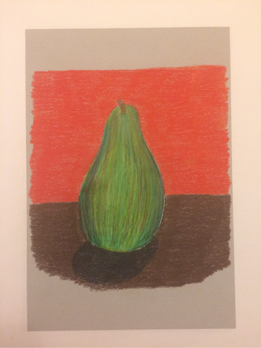
This is my original prismacolor pear that I drew. I used greens, oranges, yellows, reds, browns, and blues to add value to the pear. I believe my tenchique made the pear look a bit flat, but it was a good learning experience.
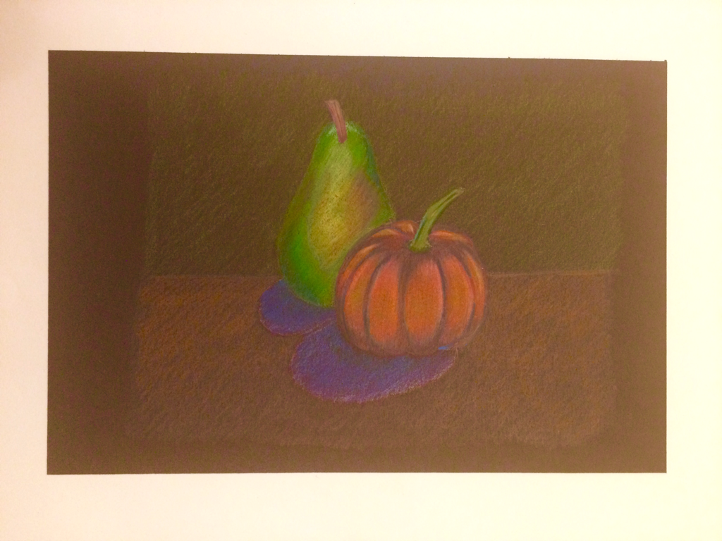
The drawing above pictures a pumpkin and a pear sitting next to each other. I used many different colors to show the value that people don't always see in these fruits. I really enjoyed drawing these and showing the shading and shapes of the fruits with pencil techniques.
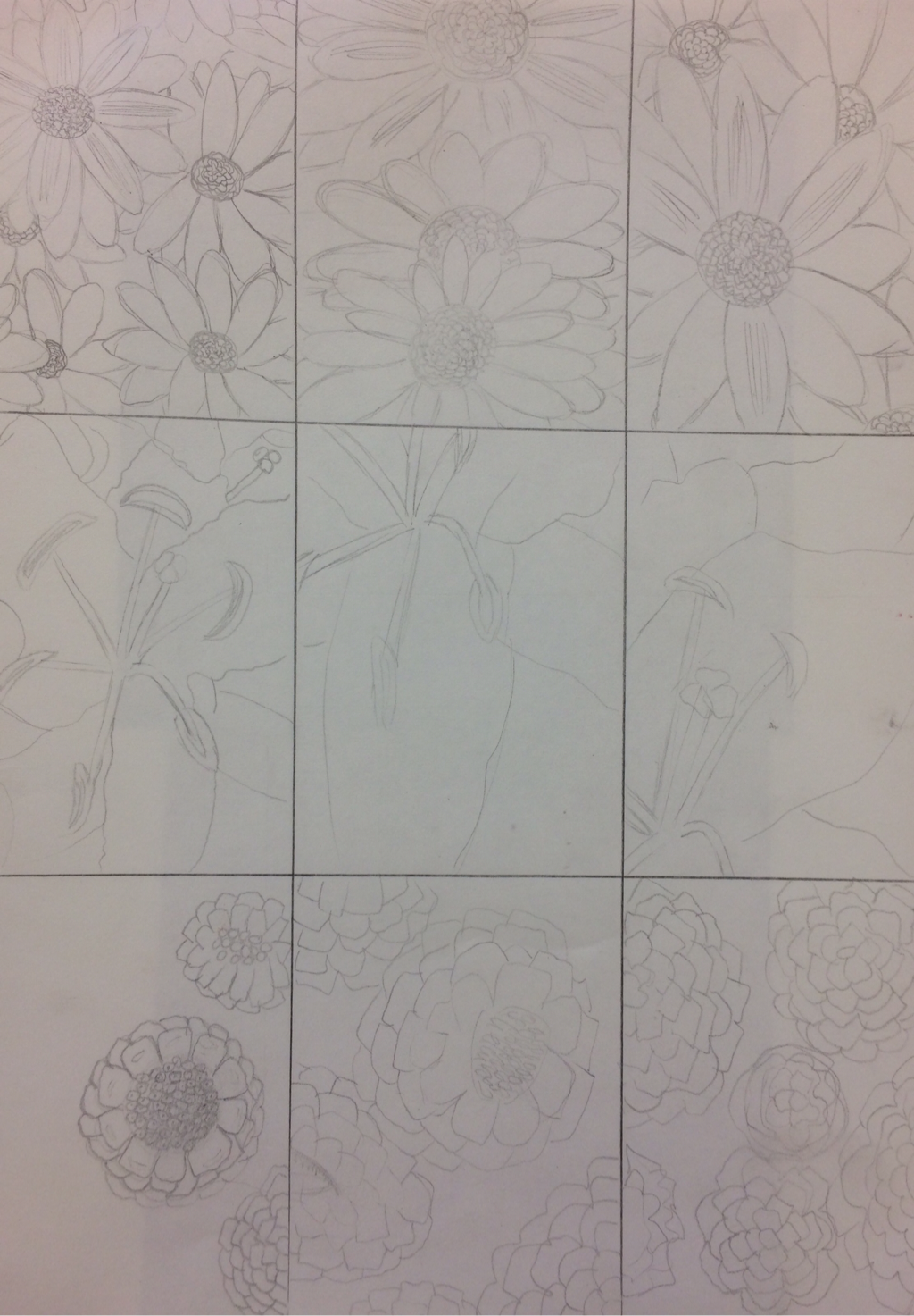
These are my compositional scetches for the Georgia O'Keeffe project. My three ideas were daisies, lillies, and raspberries. I drew each idea three separate times from different points of view. This helped me decide which idea I wanted to do for my final, with a certain medium and from a certain point of view.
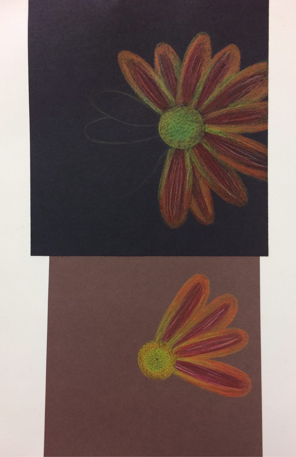
These are my final sketches for the project. I decided to draw the daisies for my final because I loved the colors and layout of my picture. I tried drawing the daisies on both black and brown paper, to see which color background compliments the brightness of the colored pencils. I really liked the way that the colored pencils looked very saturated and vibrant on the brown paper.
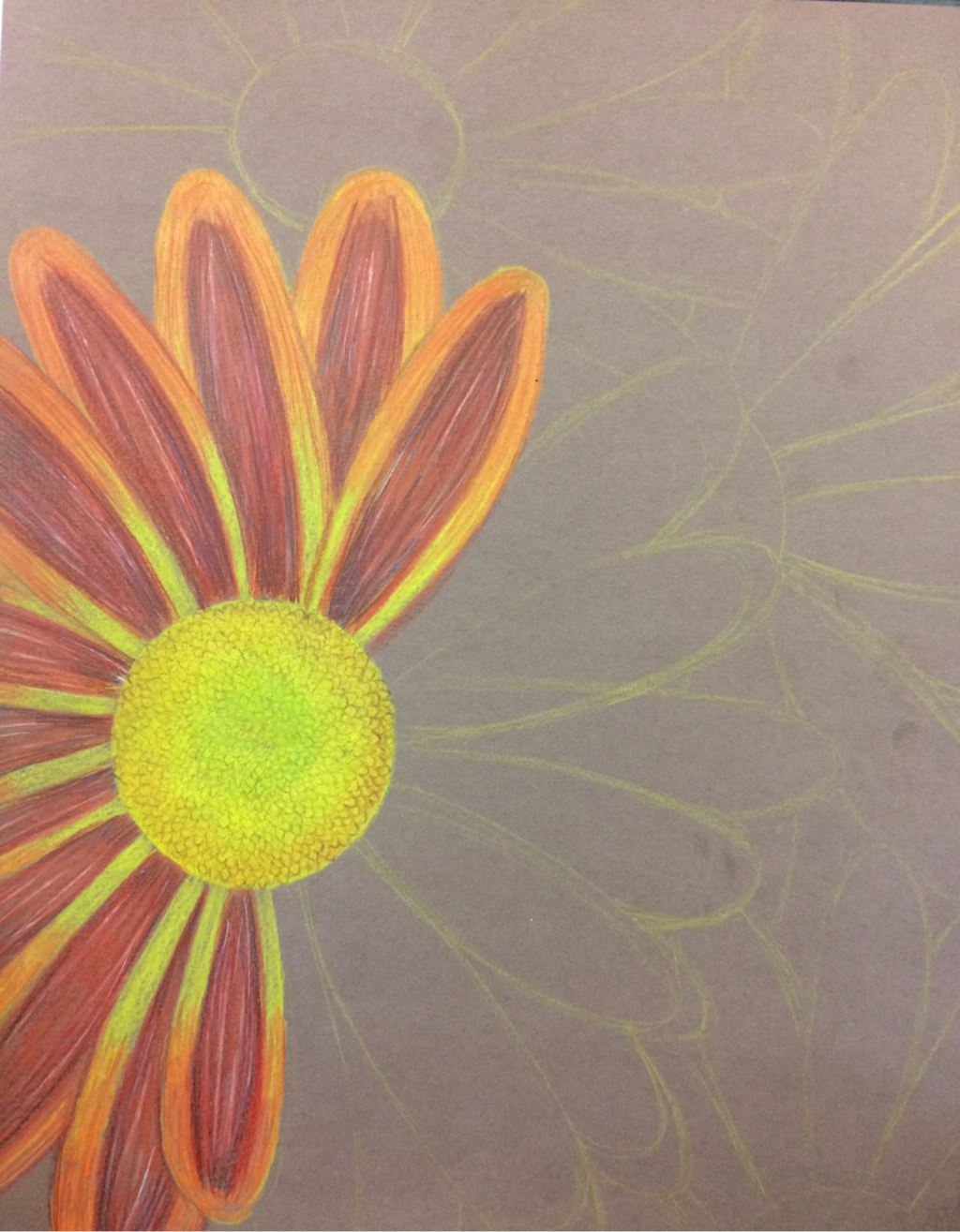
This is my in progress sketch of the daisies. The first thing I did was sketch out the layout of each flower and try to get the proportions of the flower and petals correct. Then I began to fill in the petals and the center of the flowers.
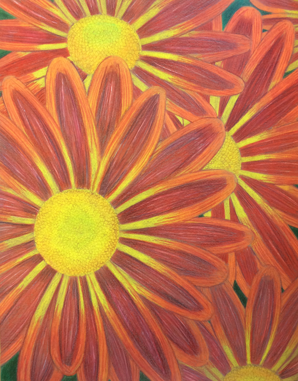
This is my final product of the Georgia O'Keeffe project. Overall, I am very happy with the way that it turned out. I think that the values of each individual petal look real and I think the colors blended together nicely.
1. In my opinion, I thought that my craftsmanship was good in this project. I was very neat with my shading and the placement of the flowers and petals. I also tried to take my time with each petal to make them look very detailed and neat.
2. I think that I did use a full range of values in my flowers. I used yellow and orange as my base colors, and I added in some dark red and purples for the dark spots, and white for the highlights. I think that these color choices made the flower look realistic. The values also give the petals a 3D illusion and they give the flowers a sense of depth from the background.
3. I think that I represented Georgia O'Keeffe in my drawing in many ways. I was able to do a close up drawing of a flower, while adding in many details and values similar to how Georgia O'Keeffe does artwork.
4. For my color harmonies, I decided to go with shades of yellows and orange-reds. I thought that these colors went very well together and complemented each other when blended. The colors made the flowers pop and made them look bright and realistic.
5. I created contrast in my drawing by adding large value changes within each petal and showing the depth and layering up of each flower.
6. I used textures, highlights, and shadows to make my artwork look more realistic. I decided to add texture to the center of each flower by sketching in the bumps in the center with a soft brown pencil. I added highlights with white colored pencils and shadows with dark red and blue colored pencils. By encorporating these small editions into my drawing, I was able to make the flowers look realistic and 3 dimensional.
7. While drawing the flowers, I had difficulties adding the shadows under each individual petals. I also had difficulties while trying to get the petals to feed into the center of each flower, and not just have a symmetrical circular center to each flower. If I were to improve my drawing, I would try to fix those small details to make the flowers look more realistic.
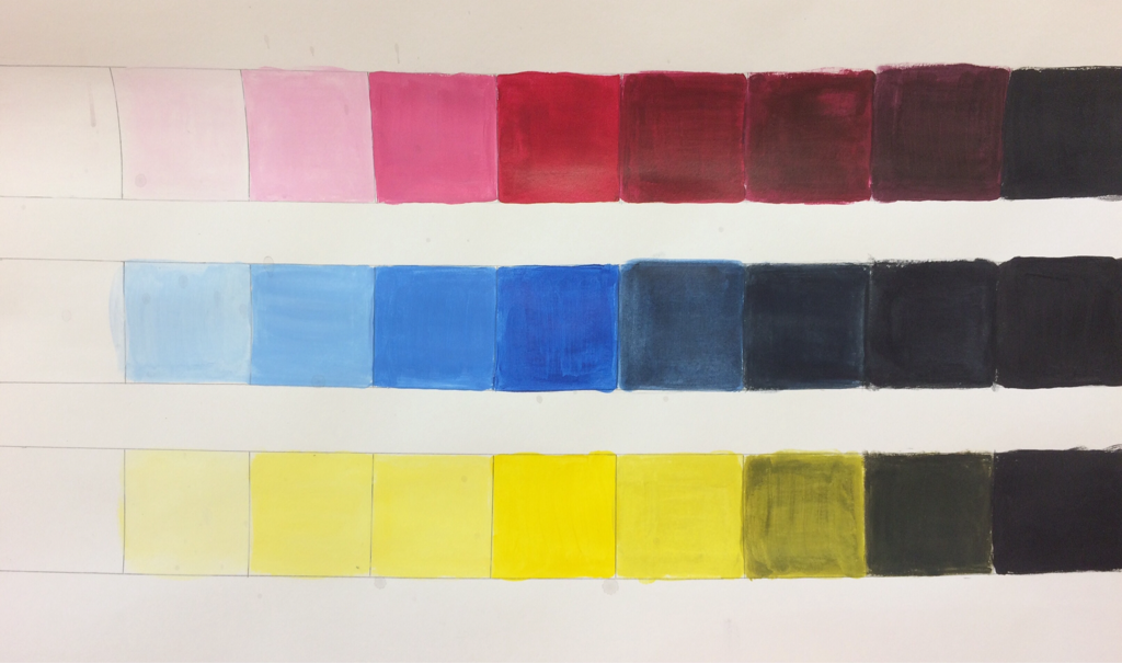
This is my value chart which I used to practice making tints and tones. In the center of each row is the three primary colors: red, blue, and yellow. To the left of the center I gradually mixed in small amounts of white paint to make the hues lighter until the eventually faded into pure white. To the left of the center I gradually added in small amounts of black to make the tones. The tones gradually got darker and darker until they reached pure black.
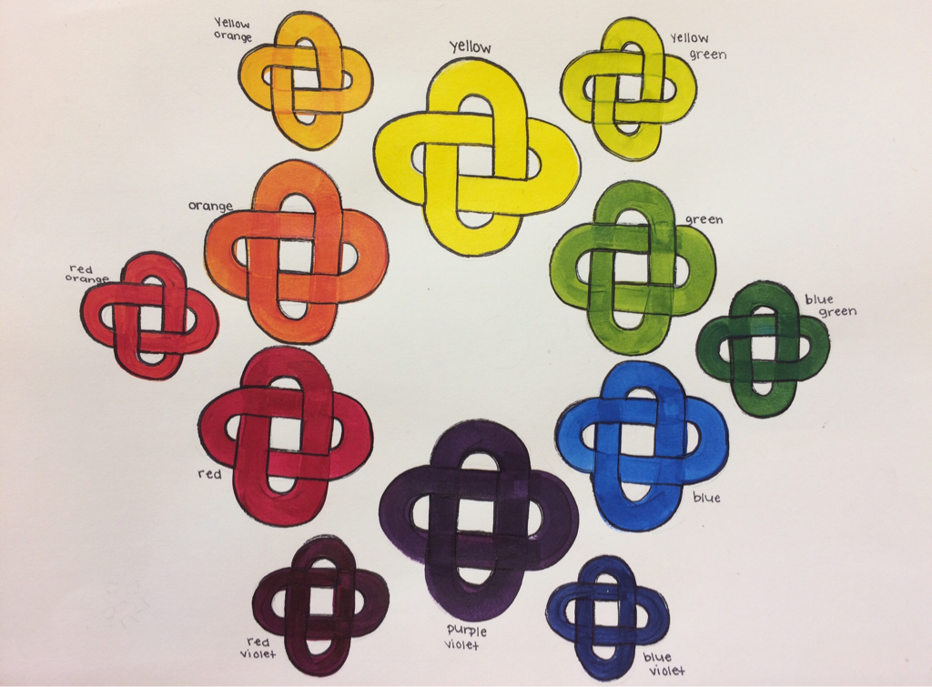
Pictured above is my color wheel which I created. I started with the three primary colors: yellow, blue, and red. I then mixed the primary colors to make the secondary colors. (An example of this process was mixing yellow and blue to create a green hue.) After mixing primary colors to create secondary colors, I worked on the tertiary colors. In order to make tertiary colors, you must mix a primary color with its nearnest secondary color. (An example of this is mixing the primary color red with the secondary color violet to create 'red-violet'.) I decided to do 12 rings to show the different hues on the color wheel because I thought it would look unique and interesting.
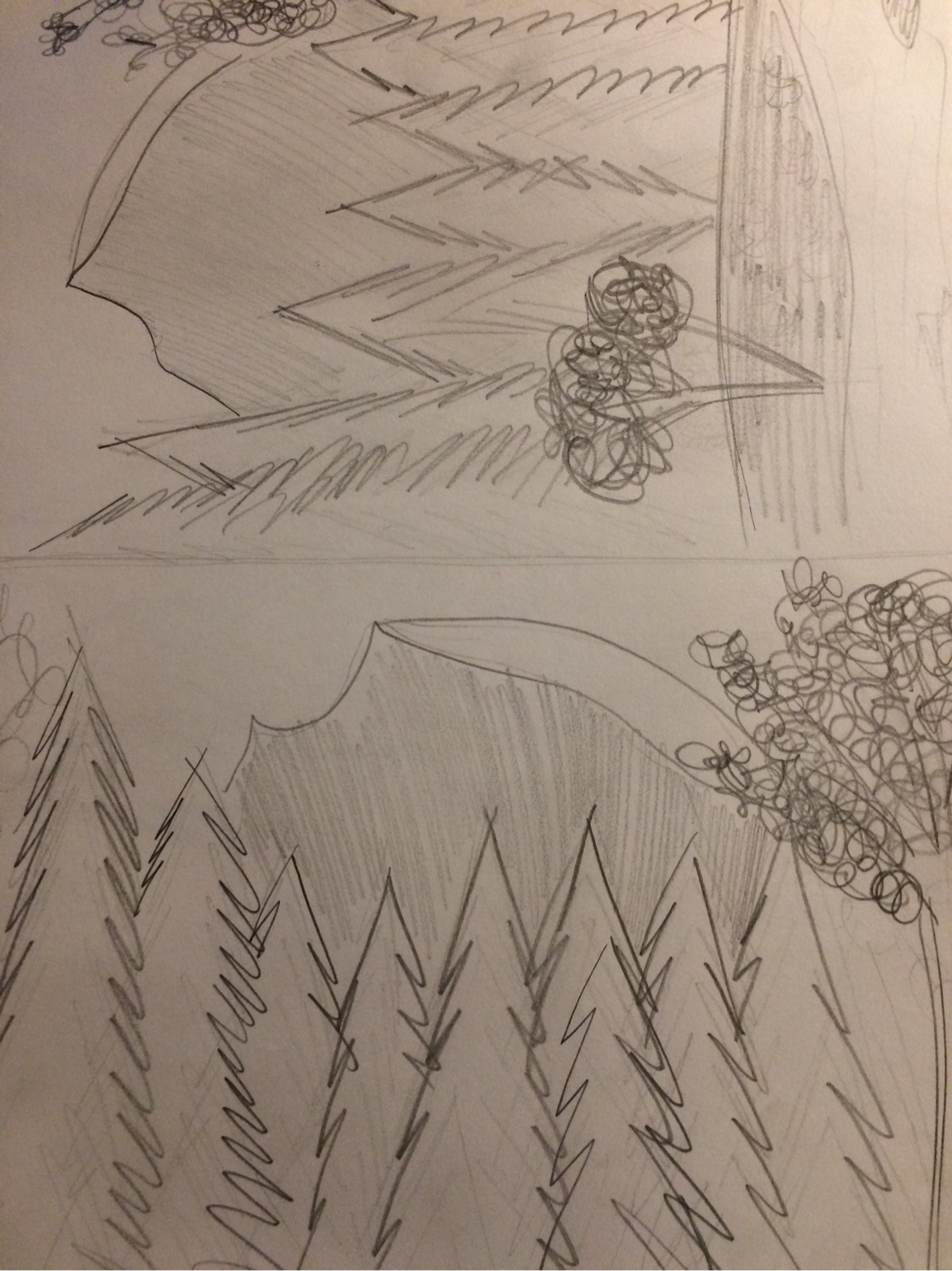
These are my sketches for my Henri Rousseau project. I decided to take a picture of half dome rock, a popular site at Yosemite National Park. I loved the perspective of the trees and the details in the rock, and I thought it would be cool to paint one of my favorite childhood memories. My sketches are very simple. My main goal was to decide what composition I wanted to use and where I wanted to place each object. As you can see above, I did another sketch to practice my painting techniques.
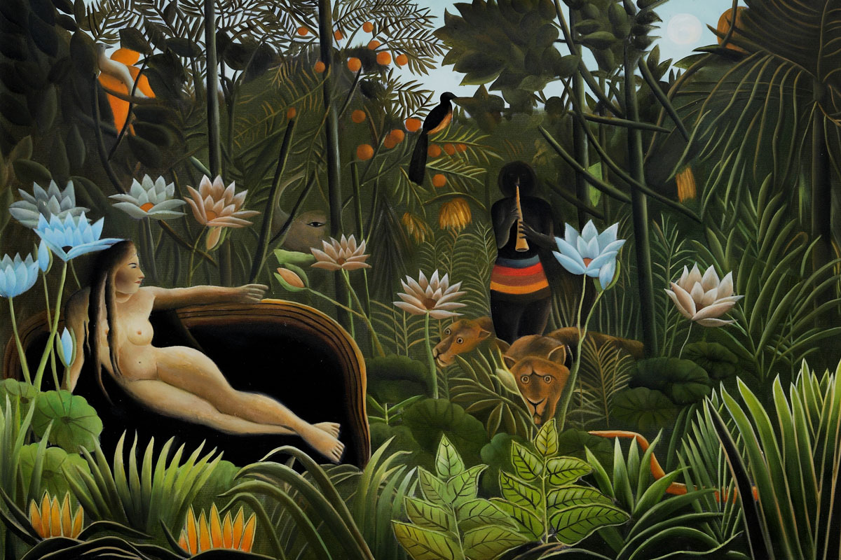
Pictured above is one of Henri Rousseau's most famous art pieces called 'The Dream'. As you can see above, he liked to draw simplified versions of humans and animals and he had a very childish and primitive style. He often painted jungles and he outlined each individual plant to look slightly childish and naive. Although he never actually got to visit a jungle in real life, he had an incredible imagination and vision of what it may look like by hearing stories and seeing pictures from friends. He will forever be known as a post-impressionist painter who make a mark on the world of art and left lasting impacts on many other famous artists.
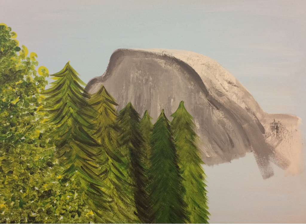
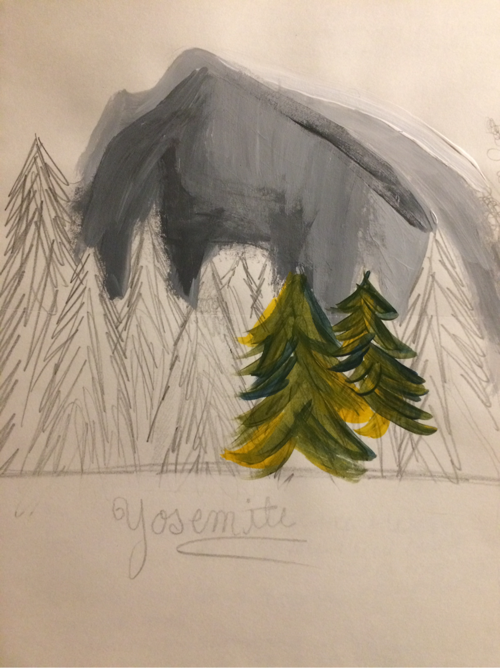
This is my in progress painting of Yosemite. Henri Rousseau was known to have a childish and primitive art style. He used many different shades of greens in his trees and he often outlined the individual leaves with a darker color. I tried to capture his style by using many shades of green and as you can see I gradually began to add darker outlines around some of the trees.
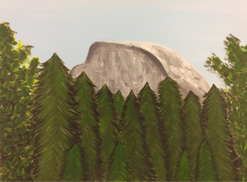
This is my final piece for my Henri Rousseau inspired painting. I added a lot of darker details into the rock to show the natural shape of the split rock. I darkened up the trees with dark shades of greens, and outlined each tree with a very dark shade. On the end trees I outlined each individual leave similar to the way Rousseau would in his style. Overall, I was pretty happy with the final and I feel that although this was a hard landscape to work with, I captured his style by simplifying the trees and rock.
1. My artist was Henri Rousseau.
-He was widely known for his childish style of art
-He lived in Paris, France his whole life and was a self-taught artist
-He never actually got to leave Paris to view a jungle in real life although most of his paintings depict jungle scenes
-He left marks on famous artists such as Picasso
2. My painting was neat in my opinion. I tried to control the brush strokes in the rocks and trees to make them look realistic and with the style of Henri Rousseau. The controlled brush strokes prevented the painting from being sloppy and unrealistic looking.
3. The most difficult part of this project for me was definitely capturing the artists style. My personal style is very realistic and detailed, but his style is very childish and simple. It was hard for me to simplify the trees and rock because I personally think of those things as being very detailed and exquisite. The rock was also very hard for me to paint, because I had to play around with how I wanted to make the rock look both realistic and childish.
4. For my color choices, I decided to use many different shades and tints of green. Henri Rousseau used many different layers of green colors in his trees and plants which make them look much more interesting. I mixed up about 6 different shades of green and layered them up in certain spots to make the trees stand out more and make the trees blend together as a whole forest while still allowing each individual tree to stand out as well.
5. The style of my landscape reflects some of Henri Rousseau's artwork because he often chose to paint trees and jungles similar in some ways to the picture from Yosemite which I chose to paint. He outlined many of the objects, therefore I tried to copy that style and outline the trees and the big rock. I used many different shades of color like he did and I also made the scene simple compared to the realistic picture, like Henri Rousseau did while depicting jungle scenes.
6. I believe that if Henri Rousseau were to see my painting today, he would see similarities between the style of our paintings, but he could also point out differences. This picture was very hard for me to simplify, especially because it wasn't as close up and outlined as his perspectives were. However, I think that he would probable be pleased with the way that I was able to outline the rock and the individual trees, and even the leaves on the end trees similar to his own paintings.
7. If I were to do this project again, I would chose a picture with a closer view. This would make it easier for me to paint the individual leaves and show the primitive details in each of the trees. I would also try to practice a bit more with the rock and see what I could do to outline it a bit more and make it look more naive. I was happy with the way that I outlined the trees, however if i could redo this painting I would try to outline the individual leaves in the trees a bit more.
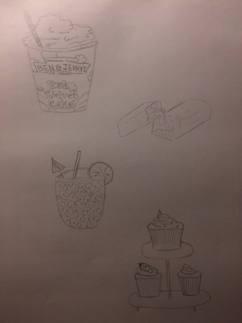
Pictured above are my clay food sketches. My four ideas were Ben and Jerry's icecream, snickers, a pineapple drink, and cupcakes. These were my top four choices because I thought that they had interesting textures and details which I could have fun creating out of clay. I also loved that these were colorful for the most part, so I could create clay food that didn't look super bland.
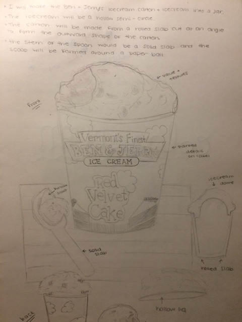
This is my final sketch of the Ben and Jerry's icecream carton. After sketching out all of the other ideas, I decided that I was the most interested in the texture of the icecream. In my final sketch I planned with great detail how I would construct the icecream and the carton into a jar shape, with a ice cream spoon off to the side. I drew the final sketch from several different perspectives to show the textures and structure of my project from different angles.
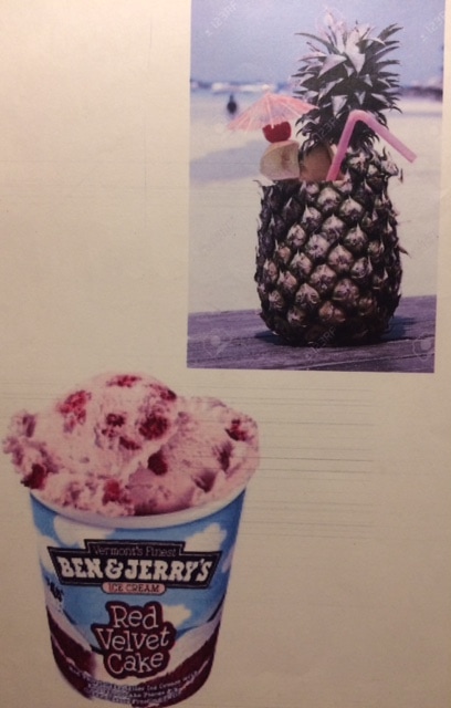
These are my reference photos for my top two choices. These photos helped me a lot by showing me the details in the foods and the shapes of each piece.
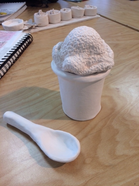
This is my in progress photo for my clay foods project. I was very happy with the way that the texture of my Ben and Jerry's ice cream turned out. I thought that I did a good job making the icecream look realistic and in making the carton and spoon as smooth as I could.
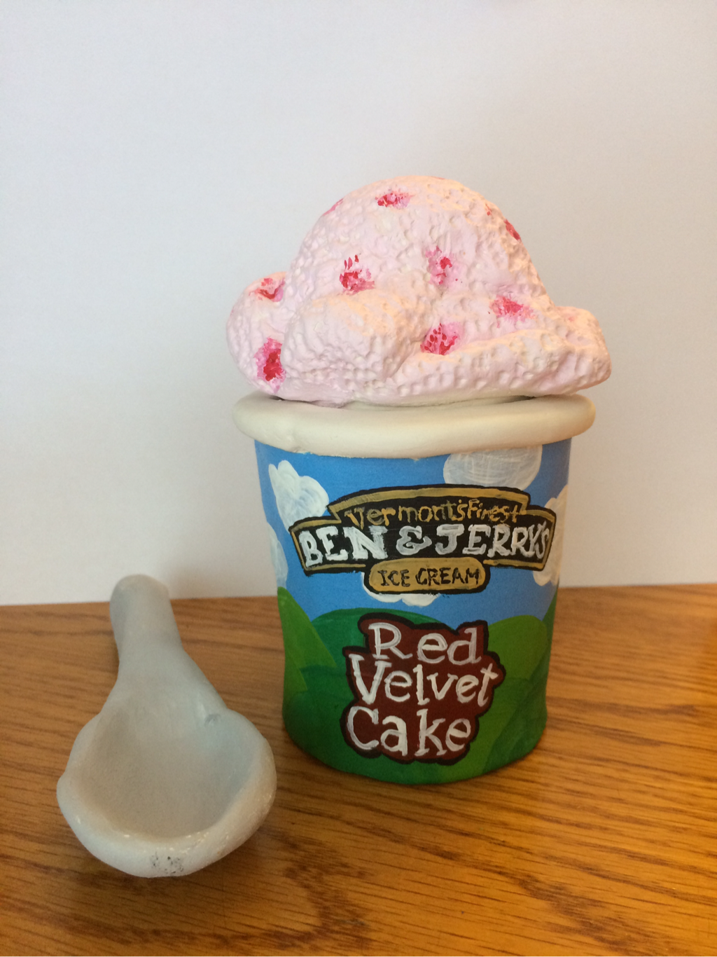
Above is my final product from the clay foods project. I am very happy with the way that it turned out. I worked very hard with the texture of the icecream and the smoothness and shape of the carton and spoon. After the clay was fired, I painted it with acrylics to make the overall appearance look more realistic. I made chunks of red velvet in the light pink icecream, and I tried my best to make the carton look like the real ones.
1. I believe that the craftsmanship of my sculpture was neat. While making the icecream I tried very hard to smooth each clay overlap and to smooth the air bubbles. I tried to measure out the base of the carton and the sides of the carton so that they fit together well.
2. The most difficult part of the project for me was making the carton the right size, and making the spoon smooth and the correct shape.
3. In my opinion my colors worked together well. I went off of the reference photos that I had and I made the icecream light pink with pink/red spots for the red velvet chunks. Then I looked at the cartons and used similar shades of colors for the colorful carton. The spoon was just a basic light gray just like how you would see a real spoon.
4. My sculpture is interesting from all views, because I continued the texture of the ice cream all the way around. Also, on the ice cream carton I followed the print of clouds and rolling hills all the way around the carton similar to the real cartons.
5. Sulptures and 2D drawings, paintings, etc. are very different. This is because while sculpting a real clay object you have to use certain tools to carve the clay and make the textures look real. While making 2D artwork you have to use different shades of paints or pencils or whatever materials you are using to add up more colored layers and add more details.
6. I created textures in my sculpture by tapping into the ice cream with the end of a tool. This created tiny dents in the icecream to make it have an airy texture. I also used my wet fingers to smooth out the carton and the spoon.
7. In my opinion, my sculpture does look very realistic. I think that the dents in the icecream and the folds in the icecream gave it a very realistic shape and texture. I am also happy with how the carton turned out, I think that the details on the label look similar to the real ones.
8. If I were doing this project again, I would work a little bit more on the spoon. I wasn't very happy with how the spoon ended up looking. The overall shape was good, but I think that it may have gotten smooshed on the edges a bit.
Printmaking 10 ideas:
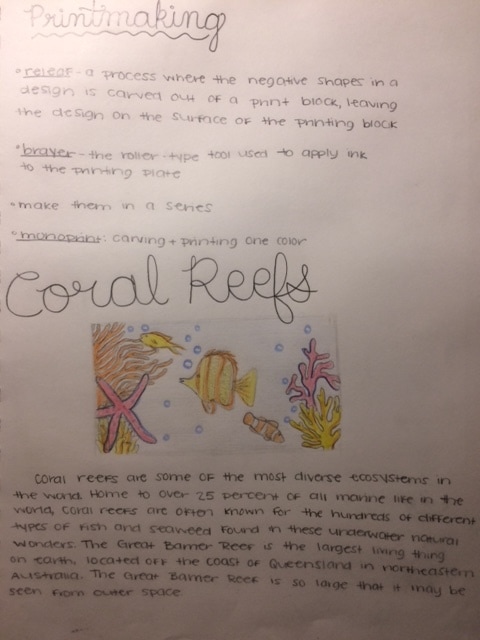
1. Great Barrier Reef
2. Colosseum
3.Grand Canyon
4. Northern Lights
5. Niagra Falls
6. Great pyramid of Giza
7. Taj Mahal
8.Mount Everest
9. Amazon rainforest
10. Dinosaur
1. Great Barrier Reef
2. Colosseum
3.Grand Canyon
4. Northern Lights
5. Niagra Falls
6. Great pyramid of Giza
7. Taj Mahal
8.Mount Everest
9. Amazon rainforest
10. Dinosaur
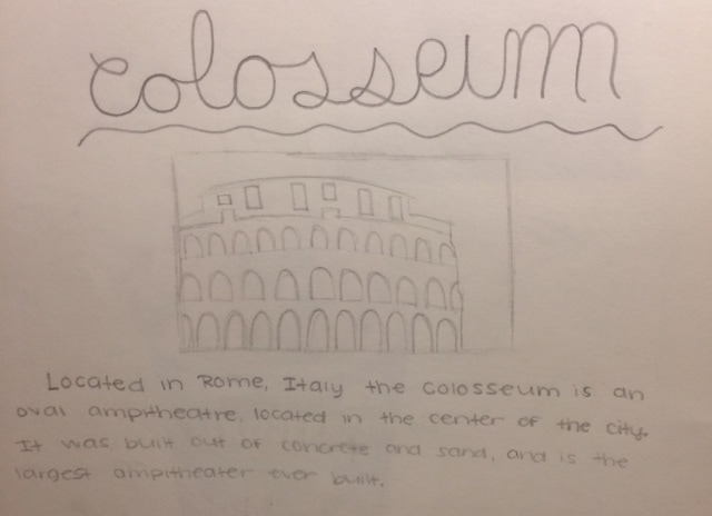
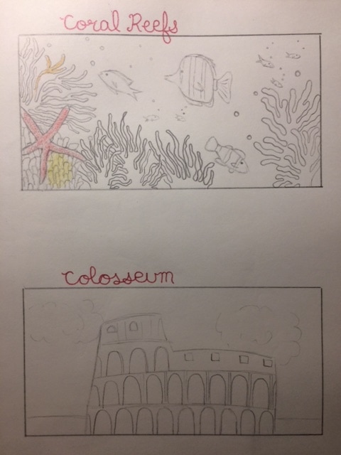
These are my sketches for my top two choices: the Great Barrier Reefs and the Colosseum. I chose these two because I loved the details in each and I thought they were both unique and I have a lot to work with. It was interesting to research both of these places so that I had an understanding of what I was sketching.
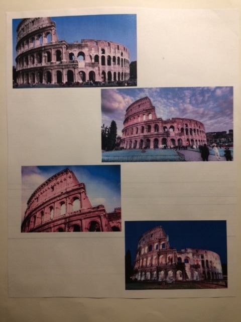
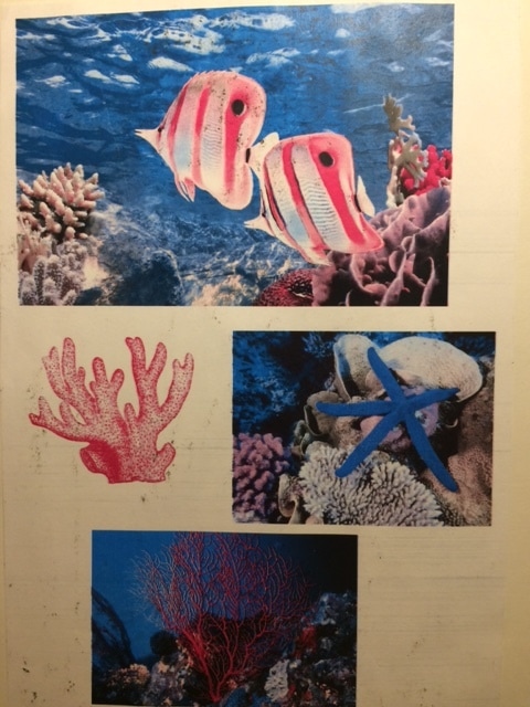
These are my reference photos for the Great Barrier Reef and the Colosseum. Because I had four different pictures of each, I was able to sketch them with my own perspective and imagination.
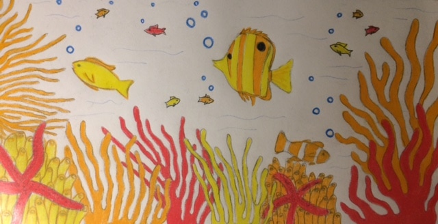
This was my final drawing for the printmakig project. I decided to do the Great Barrier Reefs becuase I loved the deatils of the underwater plant and animal life, and I knew that I had some cool ideas for the colors. I decided that I would print my finals on a light blue sheet of paper as the background, then I would use a coral color, a light orange color, a yellow color, and a dark blue color. I thought that all of these colors went together very well and they compliment the underwater scene very well.
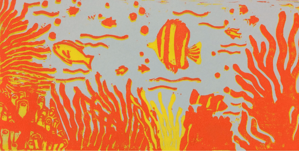
This is an in-progress photo of my printmaking project. So far, I have printed yellow and orange on a light blue sheet of paper. Originally, I carved out the areas which I wished to keep light blue, and then I begun to print the yellow. I then carved out everything that I wanted to keep yellow, and I printed orange. Next I am planning on printing a coral-pink color which will go well with the yellow and orange. So far I am very happy with how this project is looking, and I can't wait to see the final product.
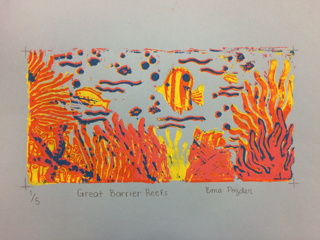
This is my final product for the printmaking project. It was very hard for me to align each layer of colors correctly, and since my objects were pretty small in general, I felt that when I slightly misaligned the print it make the end product look sloppy. Overall, I was happy with the colors which I used in the print and the details which I incorporated. I was also pleased with how I was able to show a foreground, middle ground, and also a background.
Critique Questions:
1. Overall, I was happy with my craftsmanship on this project. I did a pretty good job overall staying within the registration marks. My carving was pretty clean overall, with very little mistakes and extra scratch marks. My burnishing and ink coverage turned out okay. I tried to get just enough ink on the roller, but sometimes as you can see the colors did not turn out completely solid. At times I should have added some more ink, and at some other times I might have added a bit too much ink.
2. In my printmaking project, I used texture, color harmony's, and balance to enhance the overall project. I carved out small details (for example the bumps on the starfish) to show texture. I used pink, orange, and yellows as my color harmony. These colors worked very well together to depict a very bright and detailed coral reef. My overall project is balanced because the colors work well together, it is aesthetically pleasing, and each individual object blends well together.
3. If I could recreate my piece, I would definitely limit the amount of small objects which I chose to carve. I would also try to make the colors which I printed more saturated. If I had been able to align each layer of prints better, the final product would have ended up looking more clean.
