ART 4- Mrs. Rossi
philosophy of Art
The definition of art is "the expression or application of human creative skill and imagination, typically in a visual form such as painting or sculpture, producing works to be appreciated primarily for their beauty or emotional power". Although I find this definition partially accurate, I believe that art is much more than just that. Personally, art makes me feel something special; almost something like a mix of relaxation and excitement at the same time. When I sit down with a canvas and paint brush or sketch pad and pencil in my hand, I immediately feel content. Art serves as an escape for me, an activity which erases my mind of all stress factors and takes me into my own world of creativity and imagination. Art is almost like a dream; it takes me away from normal consciousness and takes me into my happy world.
When I create a piece of art for a special person and I see the smile spread across their face as I give it to them, I fall in love with the blessings of art all over again. I love how I can express my feelings, opinions, emotions, gratitude, or whatever I wish to without having to put my thoughts into words. To be able to visually represent who I am as a person is truly an incredible opportunity and I thank art for that every day. It is interesting for me to observe the different ways in which people observe and appreciate art; some simply seeing an assortment of blobs on a canvas while others spend hours examining the deepest meanings of the artwork. Everybody has their own appreciations and philosophies of art, in the same way that everyone has a different taste in music.
My favorite medians include paint and colored pencils, because I love creating images of nature, and both paint and prismacolors allow me to show the vibrancy of the colors. The smooth swift of my paintbrush against the canvas and the buttery texture of my colored pencils on the paper are both such relaxing and pure feelings. Although many people view art as simply trying to draw something that they have visually seen, I choose to view art as the opportunity to not only draw the immediate object or landscape, but the hidden details as well. As my wise uncle once told me, "draw what you see, not what you think you see". This statement has stuck with me since I was a little girl, always reminding me that there is never a finished piece of art and that details always exist, ready to be added to enhance the uniqueness of the piece.
reflection project
Final Artwork
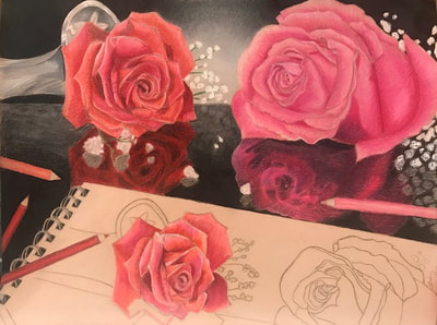
I really enjoyed working on this reflection project. It was a tough task to decide what I wanted to draw, but I finally ended up deciding to draw roses with their reflections, and a sketchpad beneath to reflect myself and how I love art. This was my first time drawing roses, and one of my first ever times using Prismacolor pencils. Personally, I loved these colored pencils because I was able to quickly learn how to blend the colors and how to use different shades to add depth.
Overall, I am happy with how this project turned out. I feel like I was able to get a good amount of depth in my roses, and the reflection turned out better than I expected it to. Personally, before beginning this project I was worried that the reflections would be too challenging to draw, but I am very glad that I accepted the challenge because I feel that I improved a lot as an artist and learned lots through the process of creating this piece.
This first project made me very excited to begin this ap art class. I am sure that it will be very rigorous and challenging, but I am excited to learn a lot and improve as an artist. Next time I work with Prismacolor pencils I would like to learn how to use the blending pencil, because I had a hard time learning how to use it during this project. I would have liked to add more blending into the reflections of the roses, but hopefully with practice I will learn new skills to help me.
ordinary object Project
final Artwork
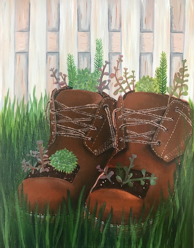
Painting these ordinary boots in an extraordinary manner was a very challenging yet exciting task for me. The idea was inspired by something which my grandma used to do when I was younger. She used to cut the toes out of old leather boots and plant succulents and other plants in the boots. I found this to be a very unique way to reuse ordinary leather boots, and I thought it fit perfectly with the requirements for this project.
Personally, I enjoy painting with acrylic paints. Although I have never had the opportunity to paint with oil, I love the ability to layer colors with acrylics. The thin viscosity of the paint allowed me to blend my colors and control my brush as I painted. Shading was very important in order to pull off this piece of art, but I feel that I was able to blend the paints well enough to make the leather boots look somewhat realistic and to give the fence and grass depth.
If I could change something about this painting, it would probably be the colors in the fence. Although it is painted with a particular style of painting, I feel like it could have ended up looking more realistic if I had done the shading in a different way. Overall, I am very happy with the way that this painting turned out. It means a lot to me and I feel that I was able to capture the beauty in this extraordinary ordinary object.
interior spaces project
final Artwork
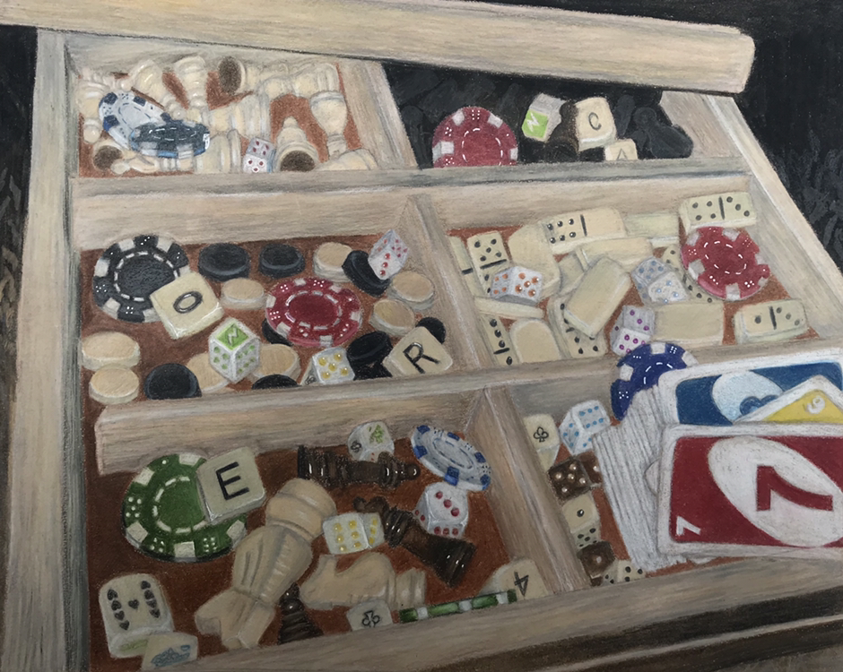
This project was extremely challenging for me, but it definitely helped me grow stronger as an artist. At the beginning of this project I had no idea what I wanted to draw. I was at home searching for interior spaces that included both interesting and detailed items. When I got the idea of drawing the inside of a chessboard, I wasn't sure if I'd be able to pull it off. I knew that the pieces are extremely detailed and that it would be a tedious project. However, I decided that since I am taking AP art next semester, I needed to begin pushing myself to think outside the box and to begin drawing challenging things.
Overall, I am happy with how the project turned out. I was worried that I wouldn't be able to pull off all of the shading and highlighting needed to make the pieces look realistic, but overall I believe that I accomplished that task. I chose to use prismacolor pencils because they are very easy to control and to blend. I love how you can work with the different colors to create any sort of shadow or illusion you could imagine. This particular project took a lot of time, considering how tiny each piece was but how significant each one was to the artwork as a whole. I had to make sure that each piece looked just as realistic as the rest to ensure that the entire drawing complemented itself.
This project helped me learn to add shading to strangly shaped objects to make them appear round. It also gave me a ton of practice with blending colored pencils. If I could change one thing about this piece of art, I would have tried to make the wood look more realistic. Perhaps adding some more browns and light tans into the wood would make it appear more visually pleasing.
fruit studies brush and palette knife
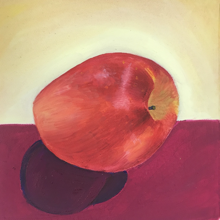
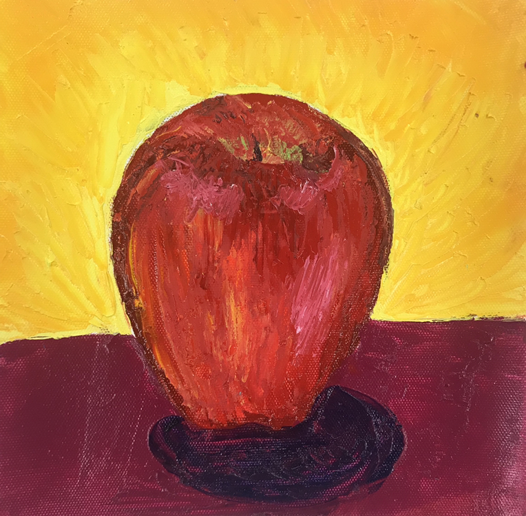
Shown above are my apples which were painted with oil paints. We had an apple placed on our table in front of us, and we had to paint the shape of the apple along with accurate shadows and highlights. This was my first time ever using oil paints, so it was a challenge for me. Working with the palette knife was a very unique and challenging experience because it is difficult to place the paint in the correct areas without the flexibility of a paint brush. When I was creating these apples, I began with the rough outline of the apples, and then I began to block out the sections where highlights were present. I then began to go back in with some of the darker reds and purples to add value and shape to the apple. The challenges definitely included preventing the wrong colors to mix, and successfully capturing each value within the apples. Overall, I feel that I was successful in getting the apples to look round and smooth. I learned a lot about oil paint from this exercise. I learned that colors mix very easily if they are placed near each other while they are still wet. This project helped me grow as an artist by allowing me to practice painting and shading techniques, especially with a palette knife.
self portrait project
final aRtwork
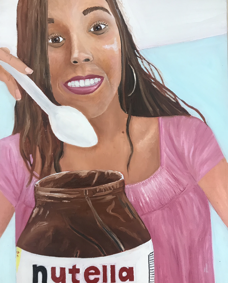
Shown above is my self portrait final project. While brainstorming for this project, I knew that I wanted to paint a photo of myself that was unique. As I was scrolling through my camera roll, I found a silly picture which represents me by both the face and the delicious nutella which I was eating at the time. I chose to paint this image because it was unique and was a good representation of my silliness. This was my first time ever doing a portrait, as well as my first ever oil painting. These factors made this project extremely challenging for me.
To begin with this project, I practiced drawing some of the main features of a face including eyes, nose, and a smile. Drawing these features with pencils helped me to learn where to shade each feature in order to make it look as realistic as possible. Next, I began to sketch out my face. The first step to this process was making sure that each of the features was placed in the correct area of the face. After I laid out the features, I began painting a base layer for the skin. From there, I began to add highlights and shadows to the face using lighter and darker shades of paint. Next I worked on the shirt and the nutella jar, and finally I finished with the background.
Overall, this project was extremely challenging for me. Doing both a portrait and an oil painting for the first time simultaneously forced me to take my time and focus heavily on each detail. The face ended up looking pretty good, but I think I could definitely improve on the shadows and highlights within the skin, and the smile as well. I grew a lot as an artist through the course of this project, and I learned to love the consistency of oil paints. This project taught me the basic skills for portraits and oil paints. It was a challenging project, but I truly believe that it helped me grow as an artist.
Pet portrait project
Final artwork
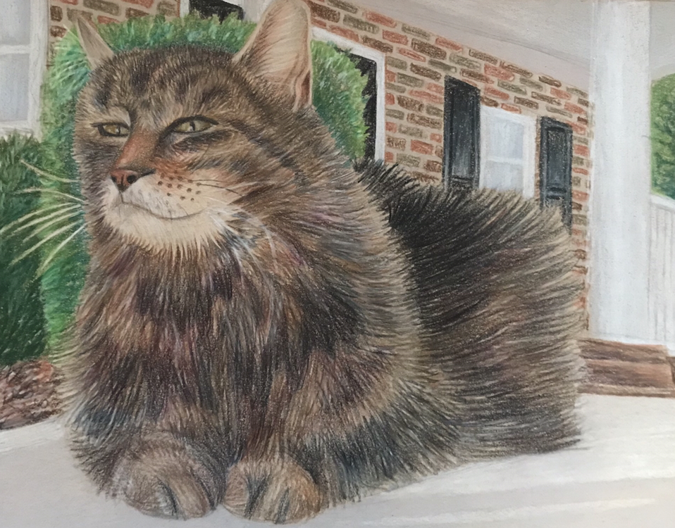
Shown above is the final product of my pet portrait. While brainstorming for this project, I knew almost immediately that I wanted to draw my cat. Looking through all of my photos, it was hard to decide which concentration I liked the best for my project. I decided to go with the reference photo which is shown above because of the position of my cat and the interesting background. This was my first time ever drawing a pet, so learning to draw the fur was the first challenging task of this particular project.
While creating this piece, I started with an outline of my cat. I wanted to make sure that I got the proportions of his body correct in relation to his head. After I sketched out his body shape, I began drawing the fur around the face. I started with small pencil strokes for the fur on the head, and as I continued further down his body I gradually made my pencil strokes longer and longer. Throughout the entire process of drawing fur, I made sure to use several different colors to give the fur more values, including purples.
The challenges which I faced during this project included the fur and the background. In the reference photo, the bushes in the background blend in with the color of my cat's fur. As I drew my cat, I decided to make the bushes green in order to ensure that the viewer's eye was immediately drawn to the cat and not the background. Throughout this project I grew a ton as an artist. I learned a lot about the importance of values and the tedious techniques required to make a cat look realistic. Overall, I am happy with how my drawing came out. The cat looks pretty realistic, and the background does not take away from the project as a whole.
LANDSCAPE PROJECT
FINAL ARTWORK
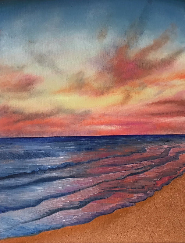
As we were brainstorming for this project, I chose this concentration as my top choice because of the vibrant colors in the sky and the reflection of those in the waves. This painting was challenging artistically because of the tediousness of the waves and the clouds.
The first thing I did while creating this piece was laying down the base layer for the sky. I started with a light blue and I pulled it down the canvas until the paint ran out. Then I blended the bottom of the blue sky with some yellow sky, and finally some light pink. After I had the base layers down, I went in with a dry brush and several different values of paint and I carefully placed the clouds in the sky. This was tedious because I had to make sure that I didn't have too much paint in my brush, and I had to make sure that the colors didn't blend to make a brown or different color which I didn't want. After I finished with the sky, I began the waves. I started by painting the water horizon with a vibrant blue. I then used my brush to drag that blue down and to subtly blend it in with a lighter blue. Doing the waves was extremely challenging because of the different values which I needed in order to make them look as if they are moving. I also had to pay close attention to the highlights and shadows under each wave fold, along with the colors of the sky which reflected into the waves.
Overall, I feel that this project helped me grow immensely as an artist. I had a great opportunity to do my second ever oil painting, and I feel that I got more comfortable with the consistency of the paint and the techniques involved in using it. I learned a lot about reflection and movement in water while painting this piece, and I learned about the importance of doing clouds in light layers rather than bold strokes.
nature turns mechanical project
final artwork
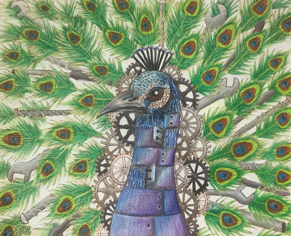
Shown above is the process of my nature turns mechanical project. As I was brainstorming for my project, I decided that I wanted to add bright colors to highlight the aspects of nature within the mechanics. I chose to go with the peacock idea because I had a good idea of how I could incoporate both the bright colors in nature and the deep greys in the mechanics. This project was artistically challenging because it had very intricate details.
When creating this piece, I started by sketching out the outline in pencil. I then went over the pencil with pen and ink, and began to color in the details with prismacolor pencils. I layered up several different values of each color, to give each feather value and to give the metal the appearance of glare.
This project was challenging because I had to be very creative with how I wanted to lay out the peacock along with the natural aspects of the animal. Overall, this project definitely taught me that it is very easy to accidentally varnish the paper. As I was layering up the values, I got to the point where it was difficult to continue adding colors. I grew as an artist through this project as I learned to expand my creativity and I learned to use different techniques for the pencils in different parts of the drawing.
Art 4 Final reflection
Art 4 was a very fun and challenging class. I feel that I grew a lot as an artist through the projects which we completed, and I made several new friends as well. My favorite projects included the reflection project, and the landscape project. Through all of the different projects that we completed, these were my favorite because I got the chance to draw and paint nature. These projects made me realize that I wanted to make my concentration about mother nature.
Some of the most important things that I learned in art four include pushing the values to add depth, and perfecting the perspective of my pieces. By adding values, my artwork looks a million times more realistic. Without adding shadows and highlights, a lot of pieces look very fake and flat.
One of the most challenging things about this class was learning how to add values into my artwork even if I can't see them in the reference photos. A lot of the times my reference photos look very flat because of photo flash or other factors, so figuring out where to add shadows and highlights was a big learning experience for me.
Additionally, learning how to manage my time and maintain my focus during art class daily was not an easy challenge to overcome. This class made it very important to stay on top of my artwork and blog posts, and it became very apparent that falling behind would create big issues.
Overall, I am very excited to move onto AP Art and to create many new pieces depicting mother nature. I am sure that I will learn a lot more about creating artwork, and I will continue to form great bonds with my classmates and Mrs. Rossi.
